

|
| ||||||||
|

|
|
Hand Infection Icon |
|
Image sizes: 1024x1024, 512x512, 256x256, 128x128, 64x64, 48x48, 32x32, 24x24, 16x16
File formats: BMP, GIF, PNG, ICO
Instantly Available Icons for Small Business Solutions
Speed up product development and save with royalty-free icons! More than a hundred small business icons are instantly available with online preview.Designing a solution for small businesses? Designing a business Web site or creating a product for entrepreneurs? You'll need professionally-designed graphics to use throughout your application, solution or Web site.
There are few options when it comes to graphics. You can order your icons from an established design company, and pay significant money. You can hire a freelance designer, pay less yet lose on quality and on-time guarantees offered by reputable companies. Or you can purchase stock images, paying just a few dollars and getting your images instantly.
Stock images offer instant benefits over competing options. Stock images are readily available, and usually come with online previews; you'll always know beforehand what exactly you will be getting, and when. Finally, if you buy your icons from a right place, a single order can be used in all of your projects without you paying extras in licensing.
Speed up product development and save big! Small Business Icons by small-icons.com are instantly available, royalty-free stock images that allow Web designers and software developers producing products, services and solutions for small businesses faster. Small Business Icons are royalty-free, meaning that you can use graphics from the collection in as many different projects as needed without paying extra licensing fees. Full online preview is available, with multiple demo icons included into a downloadable evaluation set.
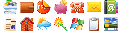
The images from the Small Business Icons library include a wide range of items, notions and actions typical for many small business products. Images such as Print, Support, Order, Money, Dollar sign, a variety of currencies, Information Security, Basket, Briefcase, Insurance, and alike are included with the Small Business Icons pack.
Technically, your purchase will get you more than a hundred small business icons in a variety of different resolutions, color depths, and file formats. All images from the Small Business Icons collection are supplied in resolutions of 16x16, 20x20, 24x24, 32x32, and 48x48 pixels. Both 8-bit and 32-bit versions are included. All graphics from the Small Business Icons set are provided in ICO, BMP, GIF, and PNG file formats. Three different states are available: normal, disabled, and highlighted.
Free previews of all Small Business Icons along with a downloadable demo collection are available at www.small-icons.com.
Copyright © 2006-2022 Aha-Soft. All rights reserved.
|