

|
| ||||||||
|
|
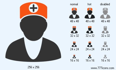
Doctor Icon |
|
Image sizes: 1024x1024, 512x512, 256x256, 128x128, 64x64, 48x48, 32x32, 24x24, 16x16
File formats: BMP, GIF, PNG, ICO
Royalty-Free War Icon Images for Shooting Games and Military Web Sites
Readily available stock army icons. With graphics such as Aim icon, Arrow icon, Maps icon, Dragon icon and Alert icons, the library of military icons can enhance any war game, weapon collector Web site or army portal.Designing a great new military game? Designing a Web portal for army fans? You’ll need graphics for toolbars, application images, navigation graphics and logotypes. Order military icons from a design studio, and you’ll have to spend hours describing graphics, wait days and weeks for the images to arrive, and spend hundreds of dollars for just a few images.
Or you can skip the design studio and just get an instantly available set of army icons. Over a hundred images of various military and army icons are available from 777icons.com in Military Icon Set for less than thirty dollars. With images such as Aim icon, Arrow icon, Maps icon, Dragon icon and Alert icons, the set of army icons can enhance any war game, weapon collector Web site or military portal. Using stock images from the Military Icon Set saves the worry of ordering custom-made icons, reduces total expenses and speeds up project development.
Military Icon Set offers over a hundred images in a number of sizes and formats. Raster graphics are supplied in 16x16, 24x24, 32x32, 48x48, 128x128, and 256x256 pixel resolutions, with vector sources in 3DS Max format readily available. 256-color and 32-bit versions are provided with every order. All True Color military icons are provided with and without a shadow, and include alpha-channel for smooth edges. All army icons are supplied in GIF, PNG, BMP, and ICO formats for fast integration with Web sites and military games.
All military icons from the Military Icon Set are produced to match Windows Vista style, and crafted in strict accordance with latest Microsoft recommendations. Military icons such as Soldier icon, Army icon, Maps icon, Fire icon, Star Wars icon, Radar and Helmet icons are provided. Small resolution images can be instantly used for toolbars and dialogs, while the largest size of 256x256 pixels is perfect for logotypes and Web headboards.
Army icons from the Military Icon Set can be viewed online at 777icons.com. After placing an order, you’ll get exactly what you see near immediately. All graphics from the Military Icon Set are royalty-free, meaning that you can use the icons in as many products and Web sites as you with without asking for permissions or purchasing extra licenses.
Copyright © 2006-2022 Aha-Soft. All rights reserved.
|

